This Wikipedia world can be brutal. But that is to be expected. The last of the five pillars of the movement makes it very clear. “Wikipedia does not have firm rules.”
Weirdly enough this approach works for me (perhaps my anarchic self enjoys it the frission and debate). But this community space also is organised and safe.
Q: Would I use online English Wikipedia for children to participate in?
A: Nope. This is not a place for nurture.
Q: Would I teach a class of teens how to contribute to an off line vernacular version?
A: Most definitely yes. There are so many examples to learn from. Some will take this further, which is awesome (see https://en.wikipedia.org/wiki/Scots_Wikipedia). Warning: English Wikipedia is a rabbit hole. But the media server is pretty good.
Q: What do you like about Wikimedia?
A:I’ve been teaching myself GeoJSON (combining open street maps and templates). Wikidata Queries is fascinating for those who want to see the semantic web. The translation options are well designed. Those who get “transclusions”, modules and templates, will enjoy the opportunity to practice computational thinking with a Wikimedian in Residence
Q: What about University students?
A: Most definitely yes. Get off the LMS and practice your thinking in public. Do it together (edit-athon), its safer. And then “scholars” who wish to push themselves onto the knowledge graph or who have some desire and need to game this system. I’ve been quite surprised at what Wikimedia can do.
I’m off to Paris for Wikimania at the end of July and I am SO excited. Looking forward to seeing you there.
Lerato (🤣🤣🤣) prompted me. I prompted Chat GPT. My WIR (Wikipedian in Residence) Community Coordinator with the African Wikipedian Alliance gave me the final push. I’m starting to record, collect and publish the statistics about the status of “Vernacular Wikipedia”.
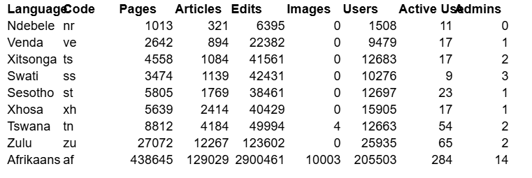
My dashboard about Vernacular Wikipedia has been placed on Github. Its offers brief information about 9 vernacular languages in South Africa. Depending which language you speak, the numbers will mean different things.
Afrikaans has the most articles (129 029) and isiZulu follows at second. (12 267). But in this is not a race, its the opportunity to learn. For example, if you look at Pages you’ll see a big a number. That’s the the non article information, the conversations and discussions, plans and edits, that goes on behind the scenes. Wikipedia has far more than articles.
If you would like to verify the data behind the dashboard, then click on Afrikaans or isiZulu for the json file. The same pattern applies to all json files. The dashboard is flashy? The json file to complicated? Then view the screenshot. This is my baseline for May 2026. I’ll try to collect the same information for the next five months.
The dashboard does make JSON prettier. https://web-learning.github.io/sa-wikipedia-dashboard/? But there is no suger coating the numbers. The current picture is for vernacular languages in South Africa is – frankly – bleak.
Not all is lost. There are some Wikipedians who ARE making a massive contribution. I’d like to introduce you to two of them (they are also from South Africa like me) who are also Wikipedians in Residence (WIR)
Twin Mosia is a South African museum curator, Mosotho cultural activist, heritage practitioner and a Wikimedian from Mamafubedu, Free State. He is a co-founder and chairperson of the Lubombo-Maloti Wikimedia User Group.
Jan Du Toit who joined the Wikimedia movement at the age of 12 in June 2017 became an administrator or on the Afrikaans Wikipedia in 2020. He has also created Wikidata items and uploaded freely licensed images to Wikimedia Commons on relevant topics. Du Toit served on the Board of Trustees of Wikimedia ZA from 2023 until 2026.
I have created another dashboard. Its not ready to be released. It shows a more comprenhesive picture about vernacular Wkipedia contributors. I’m hoping that this resource WILL give Lerato (🤣🤣🤣) an idea of who needs to be put into positions of administration.
Learn about Wikipedia, Wikdata and Commons, and how they can feed knowledge panels.
It has been my experience, that when a group of people come together and share their practices with each other, they then can also see the best in their own and each other’s work. They can then encourage each other to cross the barriers and boundaries that hold them back. This is true online and in person.
Skilled musicians have used technologies for years to produce music. They can also use web apparatus to create a Knowledge Panels (KP), those prominent boxes that appear on Google search) and become known. Its probably a good idea to do this together.
Recently, I (rather reluctantly) created a KP for myself. Its pretty rubbish because I have been quite inconsistent with my name (I refer to myself as Weblearning and Derek Moore). But, FWIW, this is what creates those convenient boxes that makes you think you know me. https://www.google.com/search?kgmid=/g/11x2l8yhp3
Five steps to claim your KP
Go to Google, enter your name and hit search.
Results will appear and if you are on Google’s Knowledge Graph, three dots will appear next to your name
Click on the dots and choose “Claim this knowledge panel”
Once on the the verification page, click, “Get Verified”
Then enter required information and submit
Note: You will have to take and upload a selfie while holding a government approved id. I DON’T like doing this and would suggest caution. Google does instruct you to cover your ID numbers. But its possible that some facial recognition detection is taking place. You will notice that my KP has a picture of me next to a Wikipedia banner. I suppose that’s the bargain?
20 years ago Chris Duigan asked me years ago to create his first website. He and I made something that I was really proud of. It was a site designed for four different target groups.
Cape Winelands
Johannesburg
Pietermaritzburg & KZN Midlands
Durban
Chris grasped a few lessons about making your digital footprint on the “Knowledge Graph” that would take me far longer to learn.
Be consistent with your digital identity
Find patrons who are trusted and you can add value to
Take steps to cross-reference yourself on trusted sources with
interviews
niche articles
links to and work with other musicians.
I’m looking forward to exploring these lessons I’ve learned with a few musician friends. Click on the image above to see the presentation. We will be looking at how to feed these knowledge panels. If you look at my KP, you’ll see it only says I have one daughter. That’s because the other one said that she did not want a digital footprint. So I did not include her in my Wikidata profile and she’s not on Google’s Knowledge Graph.
OERxDomains21 Media Pass by @visualthinkery is licensed under CC-BY-SA.
Concert Venues
This is a map of concert venues. It is populated by this GEOjson file
Take a look at
Concert Venues, that I originally created on CodePen. Thanks Chat GPT for some assistance
The third post is about maps personal cartography and my (fr) “géomatique” attempts with geodata. I’ll explore a data centred “map”, generated “automatically” with spatial data infrastructure.
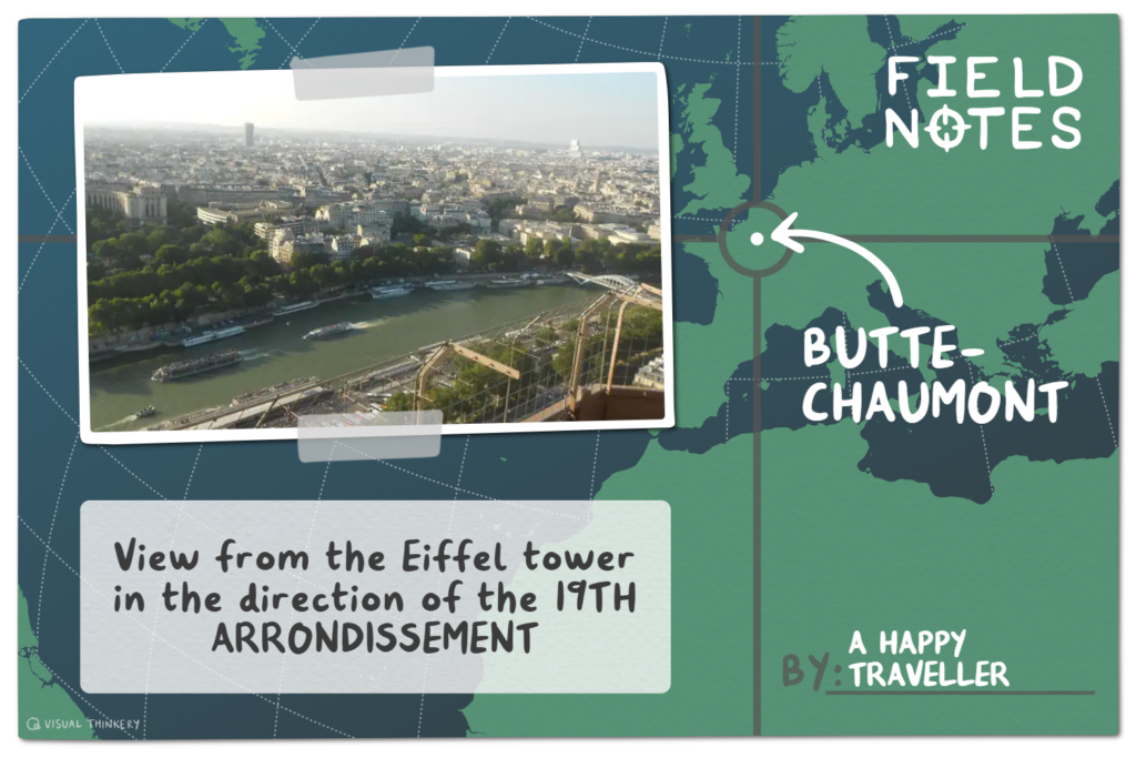
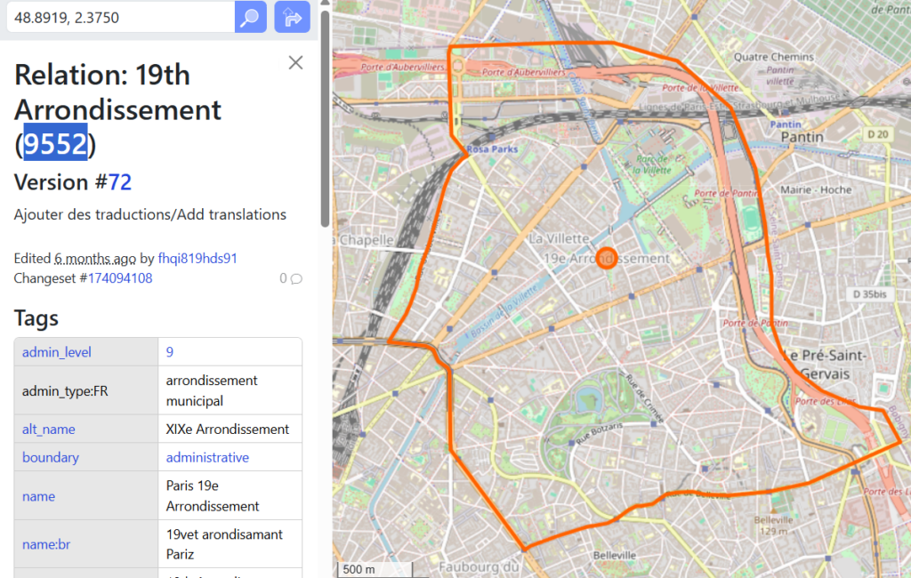
Instead of a “normal” hand drawn map (see the map of the 19th arrondissement of Paris below), or a map with a particular boundary with labels (see the Parc de la Villette map on Codepen and the corresponding 19th Arrondissement.geojson on Github). I’ll generate an Arts Festival query and compare Arts festivals in two countries and make it possible to download available information.
Firstly – how many ARTs Festivals are on Wikidata? Look at https://w.wiki/MHP7 or visit query.wikidata.org. You’ll see instructions to answer the question. “Count the instances (P31) of arts festivals (Q4801521)”.
title: Number of Arts Festivals on Wikidata
SELECT (COUNT(*) AS ?count)
WHERE {
?item wdt:P31/wdt:P279*   wd:Q4801521
}
The answer to this numbers question will vary as it depends on the available data and how well I constructed the query.
Resources Used
Sites like Geojson / Wikidata / Wikimedia Commons /Leaflet/ SPARQL/ Overpass Turbo offer access to openly licensed data, which allowes me to remix and re-use materials under stated conditions. I can combine these resources, to make layers of information visible. Sounds complicated? Yup! Demonstrable? I think so. Can others do this. Absolutely Yes! Please feel free to copy and paste.
Disclosure: I used chat GPT
Paris and Clarens
Anonyme, graveur, CC0, via Wikimedia Commons
I am off to Paris in July on a scholarship. As part of my preparation, I have been looking at Parisian maps and plotting out places / events that I want to visit /attend. There’s Bastille Day on the 14th (I’ll just miss that one) and the Paris-Plages (how cool, fake beaches on the Seine).
With my data driven spatial specs on, I’m going to make an arts festivals map. I’ll show you how to….
make a map base layer which will contain markers to artsfestival locations in South Africa and in France
position the festivals and each location on the base layer map. When clicked, a label will appear with a corresponding image (if it exists). Each festival will have a Wikidata number (for update purposes).
build the base layer map and marker on Leaflet and on a table. Data will be supplied by an openly licensed GeoJSON file generated by the SPARQL and formatted for the chart.
Wikidata, Commons, Wikipedia and OpenStreetmaps have been extremely useful as resources. They often contain co-ordinates, included map modules, OSM templates that pull in openstreetmap data or geoshapes (P3896). These worked exemplars have permitted me see how map shapes are generated and stored as points, lines or polygons. I’ve also started a collection of GeoJSON files on GitHub. Yes, Chat GPT, Leaflet and CodePen have shown how a static GeoJSON file can be turned into a visual. You can do the same (and change the parameters quickly using SPARQL). The generated file could then be archived on Wikimedia commons, built into the map itself, or uploaded as a raw file to GitHub or be included in a spreadsheet. These GeoJSON files can also be generated by using https://overpass-turbo.eu/ I’m very sure that there are more options. Its always helpful to have plan B.
Beads and baskets and SPARQL
So, we are exploring some abstract concepts. To help me pull vague abstractions together into a clear explanation, I like think about something physical and concrete. Instead of festivals, I’ll use beads and think about “trays”, “baskets” and “weaves”. You might have to think of your own.
Why physical and concrete? Let’s use another abstract concept. Time! By itself, time is hard to imagine. When you picture a clock with numbers, long and short hands, a clock face and a seconds hand ticking loudly as it passes these numbers. Then time’s passage becomes easier to notice and comprehend.
Querying SPARQL is also quite vague. So I’d like you to imagine you have scooped up some pretty beads and sorted them by colour. You need to store these beads somewhere, so you pop them into different baskets. Now assume that you have a range of beads and baskets. It gets quite difficult to remember which basket you placed which colour beads in. So you give the basket a label which links these basket and the beads in your mind. Now lets also assume that beads represent different things. Status, wealth, spiritual values. The basket label becomes is a “memory location” and the beads therein are arranged and categorized around that memory location. Now lets say that beads are not only about colours. Beads could also a way of communicating emotions in different languages. Our basket labels become more complicated. There are more variables introduced, or “memory locations” and the beads (when seen in relation to other beads) hold multiple meanings.
A Query Service called SPARQL allows me to locate beads (stored entities ) in baskets (memory locations). These beads and baskets are on Wikidata (a sister project of Wikipedia) and I can combine them in different permuatations . In this case SPARQL is going to help us identify Arts Festivals in South Africa and in Arts Festivals France. Each SPARQL query is an instruction. Go into a room that contain a wide mixture and assortment of beads. Use the baskets and sorting trays. Press play to execute a query and extract the desired beads from identified baskets. Then fill a tray with a particular collection of those beads. After that, you will string the beads together and attempt to make meaning. Drawn from matching colours or perhaps it through a Zulu love letter. The meaning could be stitched into a an image grid, a map or a graph.
Making sense of variables
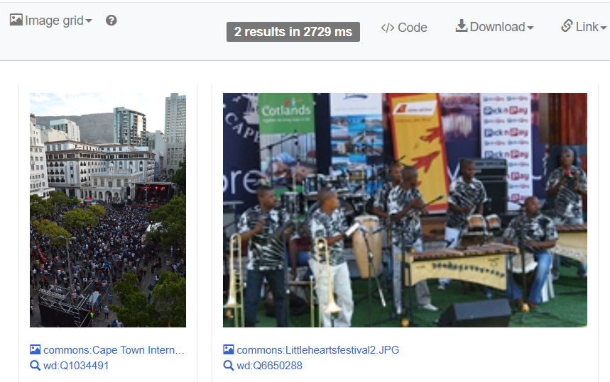
Image grid of pictures of SA Art festivals.
SA Arts festival plotted on a map
Arts festivals compared on a world map
Guide for SPARQLing : Collect arts festival beads from the basket South Africa (P258 is the memory location) . Then string festival beads together as a grid of images (and not a necklace). These arts festival (Q4801521) orbs must be local and located in South Africa (Q258). You will display the workings of your search in a tray. Eventually a collection of pictures of arts festivals from South Africa that are on Wikidata should emerge. Go to the Wikidata Query Service and paste this SPARQL in.
Look in the tray. I am a little surprised by I have found. Only two arts festivals here in SA? Nope. There are only two South African arts festivals with pictures. Notice there is also other information, some which can be downloaded.
SA Arts festivals plotted on a map
Guide for SPARQLing: Collect beads/items called Q4801521 (arts festivals) in a labelled tray. The selected beads/item must have an associated geo location (P625) and then weave / plot both the festival and geo location on a map once you press play (https://w.wiki/M8GS)
Now look at the results. You will see that there are arts festivals on the map from all over the world. Experiment and play: What differences can you see between the above two queries? Hint: I switched a few words.
Arts festivals (compared) in four countries.
Guide for code: Collect the beads labelled arts festival (Q4801521) from two baskets labelled country South Africa (Q258), France (Q142), Canada (Q16) and….(you decide). Use the geographic coordinates basket (P625) to sort them them out by location and then display the name of the festival and the country. Optional : display the image and festival URL. https://w.wiki/FJfu
If you have followed thus far, well done. This has been hard to write. It also might be hard to read and understand. Babbling is how we learn a new language.
A recap. I used SPARQL to
make an image grid of pictures from festivals.
plot out festival locations on a map.
compare arts festivals in two, three or four countries (with images and a URL).
These three queries might leaving you asking WHY? You have not found many arts festivals. Well, that’s because Countries have a geomatician deficit. We need to be exploring geospatial technology. To be making our own streetmaps. By hand, or on Wikipedia or with GeoJSON.
Wikipedia and Wikidata frequently refer to maps / geodata. We can use a GeoJSON file for creating layers above our basemap. If you do mapping, you’ll find that GIS software is compatible with GeoJSON. You’ll also find it useful to know how to add co-ordinates to Wikidata?
Data meets the map of Paris
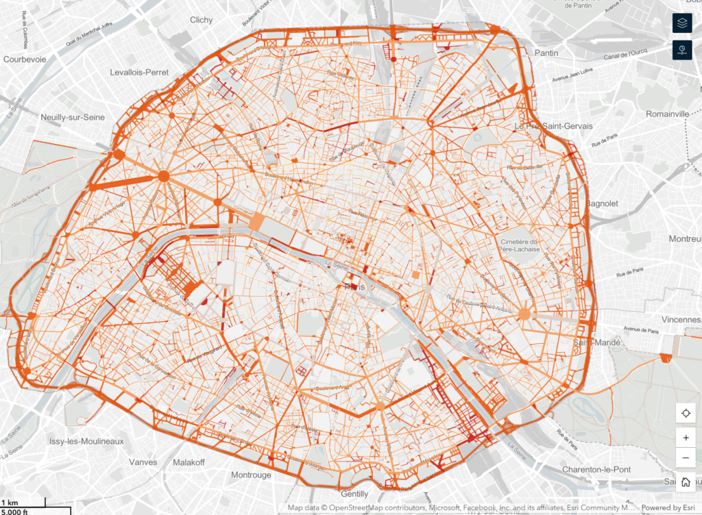
Screenshot of a vector based map of Paris. See experience arcgis com for mor about Paris map making
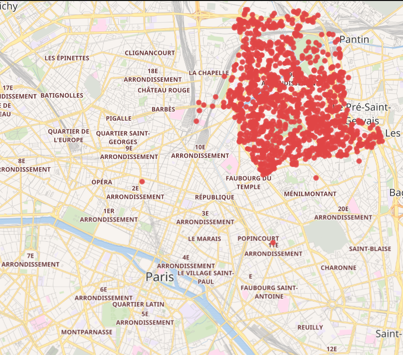
My first Paris map in this post was a hand drawn map of the 19th arrondissement. My second was a vector based map of all of Paris’s arrondissement’s . A SPARQL query (see below) shows the different points in the 19th arrondissement. If you insert #defaultView:Map and run this query, you will see a collection of Wikidata points.
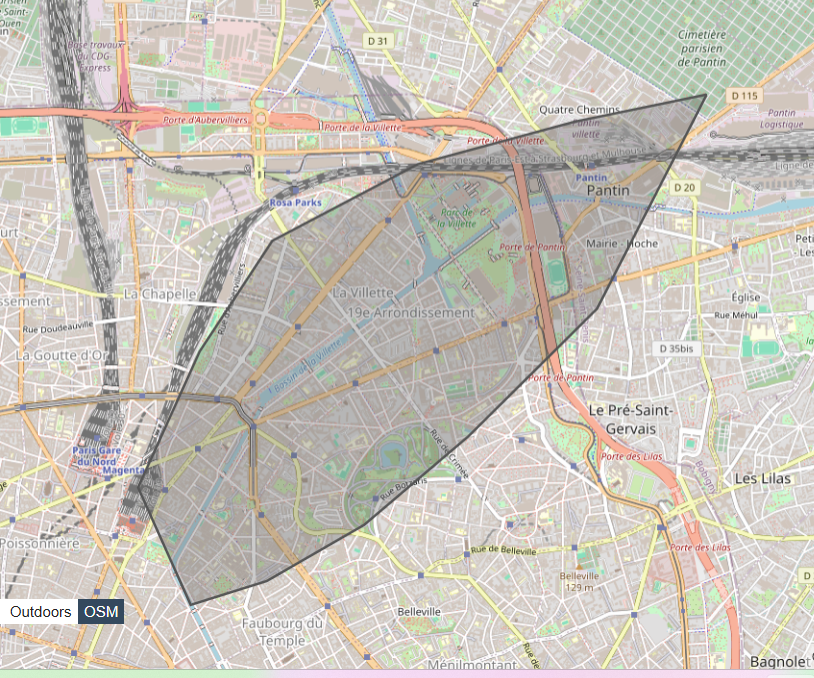
Finding the shape of the “19th arrondissement of Paris” (“Q204622”) requires detailed geo co-ordinates. The map that we have here has drawn an odd leaf shape.
If there were more details in the GeoJSON and if these were stored on commons and referenced by Wikidata, you might also be able to use SPARQL to find the shape.
SELECT ?geo WHERE {
wd:Q204622 wdt:P3896 ?geo .
}
My manual attempt at creating a boundary shape is disappointing. Thus far, I have found the best way to obtain the desired boundary shape is with https://overpass-turbo.eu/ and a query that relates to a way or relation on OpenStreetMap
I can’t really make a geo shape to accompany this table. There are arts festivals here in Johannesburg. We can make a GeoJSON file of the Johannesburg Botanical Gardens (aka Emmarentia Dam). There are many events in this park. Can we use Turbo Ovepass to draw the shape?
[out:json][timeout:25];
way(23019683);
out geom;
Nope. Did not work. Can we draw the shape from open street map? Yes. Go to Export and download a ZIP file. Unzip and open the files with https://geojson.io/. You will find that the information is rather messy. You could clean it up with Open Refine Or just find the geo-coordinates that refer to Emmaentia Park. These are a few other https://tyrasd.github.io/osmtogeojson/ tools https://racum.blog/articles/osm-to-geojson/ that can assist with GeoJSON conversions. You now have a South African shape drawn with geo co-0rdinates.
Final Thoughts
Geospatial data infrastructures allows me to abstract alternate mapping systems (from SA). I think that we can (and need to) question both the human-made and the computer generated structures that promise to address our needs, wants and desires. If we explore our built environments (with the other underbuilt parts in between) and combine our own maps with our mediated networks. then will begin to see to see a socio-technical imaginary that’s been developed to fulfil a certain group’s needs, wants, and desires.
Our tangible environment has visible physical features and less visible infrastructures. For example, a library has visible components. Books, shelves, seating areas, issuing desks, study areas, and computers. Less visible is all the activities in the book chain, who finances the books on the library shelves, who sells software licenses to the city. On campus, the visible features include lamposts, roads, pavements, benches, transport, pedestrian bridges, lecture theatres, labs, studio’s etc. The faculties committee’s governance choices, procurement processes, computer budgets and MS license costs etc are less visible, and in some cases they are hidden. In this geo spatial world, what we call our mediated environments, the visible infrastructures are privately owned devices (laptops, phones, chargers). We are less likely to see the other infrastructures – wifi routers, servers, switches, undersea, DNS records, cables etc, that join to other privately owned infrastructures and intersect with other public and privately owned components. All these visible and less visible features contribute to the socio technical imaginary that we believe holds things together. While some of these structures are in our heads (called schema) these data infrastructures can be made visible. Increasingly, it’s easier to ask private companies to create and manage the visualisation of our socio-technical imaginaries, either in public and mediated spaces. (I’m available).
So what’s my point? Yes, turn to Google Maps for directions. Admittedly, this is easy to use. But as I mentioned in my presentation about epistemic opacity, component makers comply with their political masters to build these socio-technical imaginaries. And then they make the maps to show you around. So whether you are in a physical public or mediated private space. The architecture, the landscapes and designs, the background planning, budgets and management are a reflection of the “beliefs that affect or govern the behaviour patterns of society”. Can we see and recognise what’s going on in the under mapped world. Here’s a small glimpse.
Please take a look at my Arts Festival Dashboard. You can see the source code on codepen (this will change as I fiddle with the code). The dashboard will update as you add more arts festivals.
Field Notes by @visualthinkery is licensed under CC-BY-SA. Remix by Derek Moore (Weblearning).
Maps permit you “…to write the subjective back into the supposedly objective, to take something that’s meant to be neutral, and make it personal again.”
Gerald Marx quoted in https://currencynews.co.za/art-of-the-week-gerhard-marxs-landscape-would-be-the-wrong-word/
Maps (see part 1) are more than the distance between places or way to find something. They are also are a vehicles for stories.
Making a story centred map
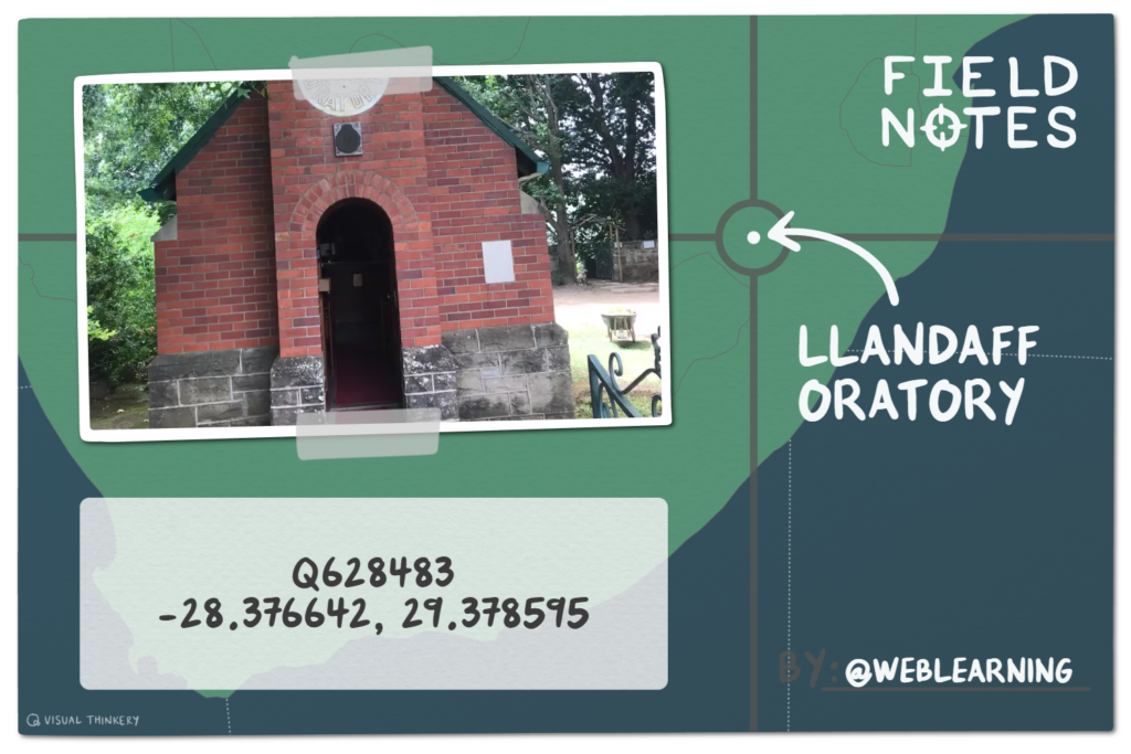
When visiting a new town, city or country, I orientate myself by going on a stroll. I try to find the “Centre Point” of a place. The centre of Middelburg is the NG Kerk (Wit Kerk) (25°45’43.2″S 29°27’25.0″E) and the Llandaff Oratory (Little Church) (Q628483) is the centre of Van Reenen. Knowing where the centre of town lies…allows me to orientate myself.
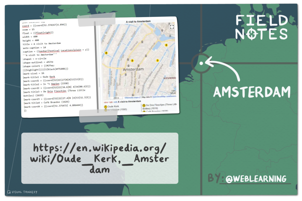
If I went Amsterdam, the centre point would be the “Oude Kerk” (lat=52.37 lon=4.89). After hearing all that religious history a visit to a “brown café” might be a nice contrast and alternative. Listed below are a few of the historic cafés. Each making a claim to fame, with a delightful story.
In ‘t Aepjen (1550)
52°22’34.6″N 4°54’00.6″E or 52.376278, 4.900167
Café Karpershoek (1606)
52°22’41.1″N 4°53’46.0″E or 52.378083, 4.896111
De Drie Fleschjes (Three Little Bottles) (1619)
52°22’27.4″N 4°53’32.3″E or 52.374278, 4.892306)
Café Brandon (1626)
52°22’31.7″N 4°53’11.2″E or 52.375472, 4.886444
You have seen how I created three general purpose location maps (for libraries) and introduced four thematic human centred maps with multiple labels for M.J. Naidoo (family history), City Centre Lobamba (places to see when in Eswatini), Clarens Festival (venues in town where events take place), the Parktown mansions (properties owned by Joburg’s Randlords ) and Guerrilla Blue Plaques (social history).
This map of Amsterdam is just another version. I’m hoping you going to try it out.
{{OSM Location map
|coord = {{coord|52.374167|4.898056}} See OUDE KERK for REGIONAL CORDINATES
|zoom = 15
|float = {{float|right}}
|width = 400
|height = 400
|title = A visit to Amsterdam
|auto-caption = 14
|caption = {{navbar|Festival Locations|plain = y}}
'''A visit to Amsterdam'''
|shape1 = n-circle
|shape-outline1 = white
|shape-color1 = {{#ifeq:{{{highlight|}}}|1|black|#ffd401}}
|mark-size1 = 16
|mark-title1 =
|mark-coord1 =
|mark-title2 = In ‘t Aepjen (1550) See IN 't AEPJEN for CAFE CO0RDINATES
|mark-coord2 = {{coord|52|22|34.6|N| 4|54|00.6|E}}
}}
These human centred maps are full of people who live or work there. Might it be possible to attach a human voices to the actual place. A story teller can weave event and places together. When these stories are shared together, trust is built, emotional connections are made.
Field Notes by @visualthinkery is licensed under CC-BY-SA. Remix by Derek Moore (Weblearning).
Human centred mapping topics
Voices from people who live in hijacked buildings in Jo’burg
If you do want to allow others to address the marginalization and exclusion that map makers manufactured, then utilising Wikimedia’s map-making capabilities, to tell stories of under appreciated, remote, ignored or even blanked out people is a great way forward.
M. Arikawa and M. Lu (2022) Ubiquitous Digital Storytelling with Local and Dynamic Georeferencing of Analog Maps. Chapter from Y. Wakabayashi and T. Morita (eds.), Ubiquitous Mapping, Advances in Geographical and Environmental Sciences, https://doi.org/10.1007/978-981-19-1536-9_2
Neumann, A. (2008). Web Mapping and Web Cartography. In: Shekhar, S., Xiong, H. (eds) Encyclopedia of GIS. Springer, Boston, MA.
This is the second in a series of blog posts about spatial lenses
#FolioFriday is a quickly spent hour. Each week I try to focus on my writing and thought. This is when the restless “monkey mind” of mine, appreciates calm and a regular routine. Even happier when my shared writing is in the company of friends. Bit like evening boarding school prep time!
FolioFriday allows me to make my voice clearer, to pull thoughts from what I know, draw ideas together from what I’ve read and concentrate this work alongside a few other people in the room. This blogging of mine sometimes does seem self-indulgent. However, the many blog posts that I have been reading over the years, have launched my practice and encouraged me to do something similar.
If FolioFriday leads to a community of academics, consultants, ed techies, teachers, young people, who would like to spend an hour thinking out loud, writing another report, or updating Foliofriday. africa in pleasant company, I’ll see that as a draw. If FolioFriday allows me (and you) to become a better writer, I’ll see that as a win.
There is a need to systematize this event, and so while blogging here, these are a few things that I need to prioritise.
Regularise my workflow so it fits with Folio Friday
Sort out the FolioFriday announcements and mailing list
Try find a way to help us all note our progress and recognise ongoing commitment
Improve / document a blogging routine.
Regularize my own workflow
Michael, Paul and I are planning to publish a chapter in the journal Post Digital Science and Education. Deadline is the 1 December 2024.
I’ve also been invited to submit an abstract by another friend
Am always pleased to have the opportunity to contribute my thinking among peers. If you look at my Orcid, you will see that I have not published that much among scholars. Read far too many trade publications and not enough scholarly work.
So before I begin the arduous/stimulating task of thinking with peers. I’m wondering if I can be a be a bit meta, articulate the implicit and explicit steps I (should) take when I am writing, putting a course together, coding a page. This is my attempt at workflow. I’ll divide the process into three (Prior, Authoring and Wrap). (Please note, this probably will change as I refine my process)
PRIOR | The pre-planning phase
Explore the idea. If this work is self generated, I open the folder named _Fiddle. If I am pitching to a client, I open the folder called _Prospects. Within each I create a folder with a date.
Understand at the brief. My inclination is always to jump in, and then hope that everything co-coalesces and fits into place. This works sometimes, but other times scope creep happens and the work becomes far bigger than it should be. As I begin to understand and process the brief, I take a large sheet of paper out and draft out the scope with an flatplan, sitemap, canvas or mindmap (FSPM). This is when I use pen, pencils, paint, paper.
Look at the brief again. Draft a “running head” on the chosen FSPM, but now make this format digital. The running head should indicate the content and attract attention, be short and simple and be aimed at a specific audience.
Select the authoring environment. Choose the environment. Will I use Word, Scrivener, my Wikipedia Sandbox, the shell I’ve set up on Github, my CodePen playground, the etherpad or my HTML template. You are going to be drawing on other people’s ideas. So have a mechanism available to ensure credit is given. Create a sub folder entitled “desktop research” in _fiddle or _prospects. For example, if writing in Word, use the Zoterro plugin. If designing a presentation, and finding images on Flickr, use Alan’s bookmarks
Prepare to submit the proposal. Proposal should reflect the client identity (logo, colours), the running head, date of submission. Before you do this, remember to
spell and grammar check,
refresh references through Zotero.
add page breaks,
update table of comments,
make sure figures and diagrams have a caption
Write a cover letter. This introduces the running head, defines the jargon, indicates the focus. You could describe (in white text on the title page), where you see things going next. After sending off, set a follow up date on email. Then follow up and ask for feedback.
AUTHORING | The production phase
Ideally, the title, abstract and outline has been generated in the prior phase. That is my draft. The authoring process work might be approached with Pew & Mavor’s “Incremental Commitment Spiral Model” (2007) and / or Wenger’s Systems Convening”.
Exploration and / or Convergence
Valuation and / or Boundaries
Foundations and / or Identity
Development and / or Agency
Recognition
These different provides a way for individuals, organizations or projects to incrementally experiment and evolve within the terrain they are working ICSM’s key practices and to evolve toward process models better suited to their needs and competitive environment
Make my documents better
One of my constant problems when writing a document is identifying my audience. Its not that I don’t know who I am speaking to, its that “the audience” is located in different territories and each audience have a different things that they want to accomplish. So questions like this are not always helpful.
Q: Who are you addressing with your document?
A: Who do you want me to address. The funder, the target audience or the scholarship? The three are very different and I’ll illustrate this with an example of Google Maps. If the funder is from Europe or Canada, then they have a certain imaginary about using maps to find their way around. If the target audience is from a small country in Africa, where Google street view is not included and data is too expensive to use maps on your phone, then there is no point in referring to Google streetview. And if I quote Polish Philosopher Alfred Korzybski and say “The map is not the territory”, but I cannot go any deeper. It’s not because I’m lazy. It’s because access to Science and Sanity is a little harder for me, with my office off campus and no meaningful library access available, to address this deficiency. My reaction to these audience uncertainties is to begin from my own head and experience. Precisely the wrong place to write a document from.
So, finding common ground between your different audiences, , when the terrain is so uneven, is difficult. Perhaps its helpful to have
a shared goal,
named stages or stopping points along your journey
a clear outline of remains to be done.
So that I can progress and achieve my collective goal.
WRAP | Pulling it all together.
This is the hardest part for me (and I confess, that there is a big gap between this part of my blog post and the previous sections), because I have not know really how to wrap this up. Conclusions seems like a recurring issue and discussing it feels very uncomfortable. I will be adding to this. But for now: On the day or week of publication:
Put the publication onto your CV
Upload a PDF copy to your web site
Compile my bibliography with Zotero and share
Update your meta data on Wikidata
Write a b;og post about it.
Thanks to https://acs.ist.psu.edu/papers/how-to-write-papers.txt for inspiration
I published the concept Folio Friday on the in Aug 2022
I registered the domain name FolioFriday (https://foliofriday.africa/ ) about a year ago (Jan 2024). I wanted to build upon the idea of making your thoughts visible. I had not given much thought to how making thoughts visible also made them scrapable, by LLMs.
Today (19 Feb 2026) I asked chat GPT this question
Does weblearning do folio friday?
A prompt made by Derek Moore:
Yes! Weblearning does have a thing called Folio Friday — but it’s not a formal event or competition like the hashtag-style portfolio days you see on social platforms. It’s more of a personal weekly practice that the Weblearning author shares on their blog. (weblearning.co.za)
Here’s the gist from Chat GPT
Replies from Chat GPT
📌 Folio Friday on the Weblearning blog
It’s a weekly habit the blog author (an educational technology practitioner) set up for themselves.
Each Friday they take some time to reflect on their week — looking at their work, learning, thoughts, moods, and patterns.
Sometimes they organize and highlight things they’ve accomplished (like work posted or achievements toward professional goals), and other times it’s more of a personal journaling moment to look back on how the week went.
The idea is to encourage reflection, openness, and shared learning, not competition or formal showcasing. (weblearning.co.za)
So — yes, Weblearning does mention Folio Friday, but in the context of a weekly self-reflection routine posted on their blog, not as an organized community event with submissions or a hashtag campaign. If you meant a different Weblearning (like a specific LMS or training provider), let me know!
Not bad chat GPT. Yes, this is a weekly habit that I try to follow. Others are welcome to join me when it suits them. Its about the practice of making your thinking visible. Two things I would like to emphasise.
Folio Friday is a small community of practices (COP) that uses the Pomodoro approach to guide our writing. Pomodoro is a simple way to keep your mind fresh. Every Friday, we meet on Zoom and write for 25 minutes, take a break and write for another 25. Focussed work is good. Doing focussed work with someone else is even better. Sharing your thoughts with others….https://foliofriday.africa/ that’s when you start to see why writing is a good habit
Login to Learn > Upload your File> Release Rights > Describe file Details
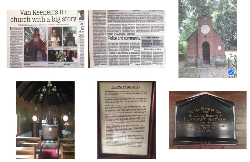
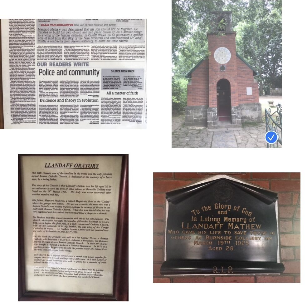
I have a picture of the Llandaff Oratory It’s the little church at the top of the pass named after Frans Van Reenen. I’d like to add this photo to the Llandaff Oratory Wikipedia page.
Screen shot of images that pertain to the Smallest Church in Van Reenan
My task – to upload the image to Wikimedia Commons. I’ve used the four phases found in the Upload Wizard.
Learn
Upload
Release Rights
Describe
1) Login to Learn (about sharing work openly with licenses)
A person who creates a photo, owns the copyright to the photograph. The photo copyright could be given away, or sold, under specific conditions. These terms are set by a legal document known as a license that specifies the nature of the agreement. A free license simply means the creator permits others to use his or her copyrighted photo without asking explicitly for permission. Open licenses make it easier to share pics with others.
2) Upload your File from your device
Select your photo. High quality images are better. You might want to size them consistently. Below you will see a picture I took of the Littlest Church at Van Reenen. The tick shows that I selected it.
Go to the Upload Wizard. Click the blue button “UPLOAD“.
The photo might take some time to upload.”
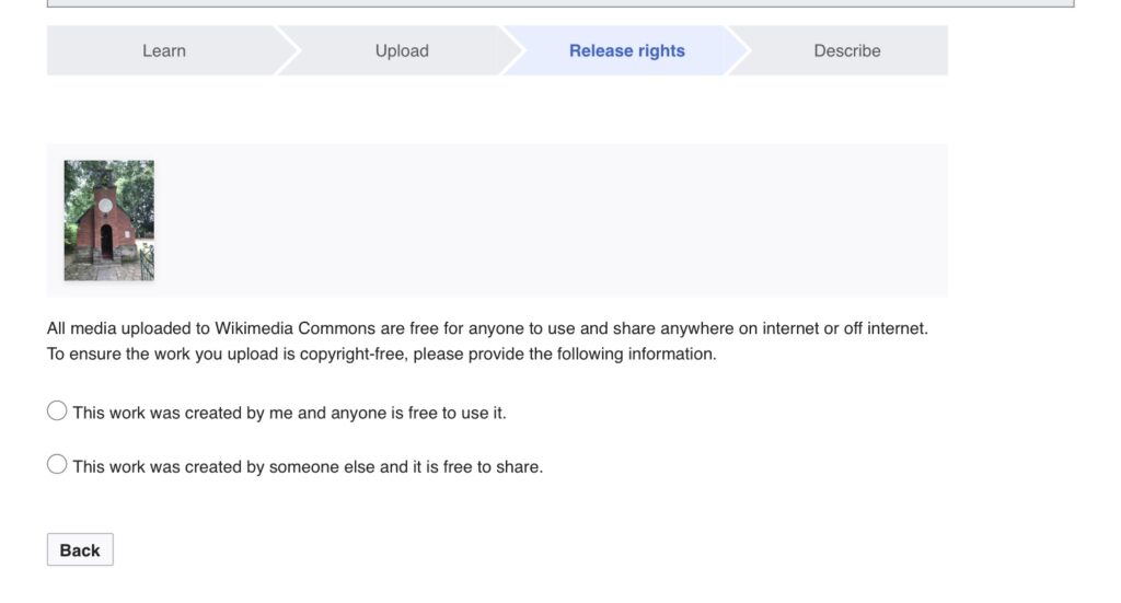
Screenshot of the Wikimedia Commons upload Wizard
3) Release Rights are all about open licensing to the Commons.
Otherwise you will be reminded about ownership of the image. Choose from these two options.
Consider an open licence? I prefer “CC BY” ensures you get credited whenever the photo’s reused. If you comfortable with code, you could try these templates with option 4 (of course you have to modify).
{{attribution|User:Derek J Moore|Weblearning}}
{{self|cc-by-4.0}}
4) Describe file Details and add extra data
This part can skipped. But metadata is very useful later on, when you have many images.
Choose a filename. I keep it short (and try to ensure that I have got the spelling right)
Add a caption. The writing below an image is the caption, it places the image in a context. You have 255-characters to write the description. You might want to add a vernacular caption too?
Published date. Select the date when the image was first published
Describe Further. Add additional information. This is optional, but helpful for others
Insert a Wikidata item. There should be a main subject visible in the photo. Locate the Wikidata number and add structured data
Add a specific category. When working with a batch of photos you might want to add a category or use an existing one.
Location. You could add the geo-coordinates (or they might appear automatically)
MORE Additional information This is a hidden field. You might be uploading a map from open street maps. They you’d use the template {{OpenStreetMap}}
Post and Confirm. You are ready to finalise your post. All that has been submitted can be checked and corrected
I was in Eswatini from the 21-22 May 2025 on what turned out to be my last training event for SWiP. My stay nearby to the Residence of Ndlovukazi (the Queen Mother) at Lobamba, Eswatini was far to brief. Muzi tells me that this is the royal, spiritual, cultural and political heart of Eswatini (previously called Swaziland). I probably broke far too many cultural taboos. Crap!
Sadly, I could not visit Umsamo Wesive (the national museum), wander around Libandla (bi-cameral parliament) or watch the Sihlangu Semnikat (the Kings Shield) practice at Somhlolo Stadium (the national stadium). But I did have a fabulous three day workshop at King Sobhuza II Memorial Park. And then I created a map for the organisations in town.
{{Lobamba City Mapp}} – Places that I did not visit when in Lobamba. Made with OSM Template
Although these locations were in walking distance of my hotel, I had double-booked myself for the “Great Debate”. So instead of exploring, I spent my days working alongside aspiring Wikipedians (journalism students, academics, and educators) on this WikiProject: Eswatini. Nights were spent planning (and worrying) how I would manage the “Great Debate” Topic: LLMs in Higher Education, which was scheduled for Friday, 23 May, my departure day.
Unlike other SWiP events, the visit to Eswatini did not have a post-event workshop evaluation. So I thought I’d share my thoughts with SADiLaR colleagues and Wikipedians
Code cannot completely compensate for poor language
We need to create conversational designs
An aggressive template – and quick cover-up
Unanswered Questions
1) Code cannot completly compensate for poor language skills?
Now if you speak Siswati its possible that you are chuckling (or cringing) at my poor attempts at this language. I share the sense of embarrassment. I am bilingual, speak Afrikaans (average) and English (reasonably well). But unlike the majority of South African citizens, I don’t speak or write any vernacular languages and I often get things wrong.
I’ve noted before that language support for Siswati (and other South African vernacular languages) code on Wikipedia is minimal. But what I have not quite comprehended is just how much of the code underneath English Wikipedia templates and modules also needs to be installed onto the vernacular platform. Neither can I find too many clear vernacular guidelines on installing the code.
English Wikipedia has access to a wide code base and explicit policies and guidelines. What isn’t clear to me, at least here in Wikimedia South Africa, who are the people in charge of each language group and which policies do I fall under?
Wikipedia is available in almost 350 languages. Each language has its own community of volunteers. Efforts have been made to create translation resources, so that we can build on each other’s work. But the languages that have documentation and support are minority world languages. Regular communication is sent in English, not vernacular languages. For an organisation that intends to make all the worlds knowledge freely available, this is disappointing.
Vernacular Wikipedia has a partner in the form of Wikidata, a free, collaborative, multilingual, secondary knowledge graph. Wikipedia and Wikidata have the potential to bring transformation for in minority languages in the majority world. You can freely correct and improve what has been written in Wikipedia and Wikidata. For example, my poor attempts at Siswati, isiZulu and Afrikaans on Wikipedia can be corrected by any of you. But when I add to Wikidata, then that information on that platform can be algorithmically translated and placed in all language versions. How good are these translations?
I suspect that my coding across Wikipedia platforms and averagely translated sentences, simply creates technical debt? Code does not compensate for my poor language.
Accomodation was not at Mlilwane, but were were comfortably housed at Happy Valley Hotel (-26.440434,31.188795 | 26°26’25.6″S 31°11’19.7″E). During the day, the Knowledge Workers (my pet name for the SADiLaR crew) with Herschall and I ran sessions. Henry Count Evans had assembled a fine bunch of people for the workshop. I enjoyed talking to aspiring and interested Wikipedians more about ss.wikipedia.org. It was clear to me that they were all quite familiar with the platform. After the workshop had finished, I popped into every Wikipedians sandbox and there I left them a message {{New userpage}}. The code can be read below.
{{ombox
|type = notice
|image = [[File:Essay.svg|50px|link=]]
|style = background:#f4f4f4;border: 1px solid #FFB2B2;
|textstyle = color:#0A0A0A;
|text = Hello, ”'{{SAFESUBST:ROOTPAGENAME}}”’, so glad that you joined us at the [[Training_workshop|Training Workshop]] a few days ago! Thank you for contributing to [[Wikipedia]]. I hope you enjoyed the experience and want to learn more. Maybe join a [[Wikipedia:Meetup|Monthly Meetup]] and connect with other Wikipedians?. Perhaps experiment in ”'{{#if:{{{list|}}}{{{a|}}}|a|the}} user [[Help:My sandbox|sandbox]] of [[{{NAMESPACE}}:{{{1|{{ROOTPAGENAME}}}}}|{{{1|{{ROOTPAGENAME}}}}}]]”’. (PLEASE NOTE: A user sandbox is a subpage of the user’s [[Wikipedia:User pages|user page]]. It serves as a testing spot and page development space for the user and is not an encyclopedia article.)
}}
I did not get a great response. Later I went back to what English Wikipedia calls the Tea House. SS calls it Likhefi leinthanethi which (if Google translate is right), means Internet Cafe. Today, if you visit this page, you might note the interaction, it is all one way and in English.
Khuluma nebantfu
There is often an apology for not using vernacular. But no attempt to hire or appoint someone who might assist. Now Bobby Shabangu is from that part of the world and I saw once that he was translating the communication. But gradually it has become a broadcast instead of a conversation? But I suppose when you have been a radio DJ, then maybe broadcasting stories comes more naturally than interacting? Or perhaps the organisational structures of Wikimedia, who send out the same press release across all platforms. Go through the typical corporate publishing process where all has to be approved and stay on brand.
Erica Hall wrote a book about Conversational Design (its free to download). She encourages designers to be story listeners and interreact with real people, to make social connections. Our conversations involve give and take and our orality makes us human. She has a lovely quote there.
Orality knits persons into community
Walter Ong
3) An aggressive template
iThempleti:Simple box is a template that creates an infobox in SS Wikipedia.
The instructions are clearly given. “A simple infobox that can be used for basically anything. All parameters are optional. If you don’t need all the lines, just leave them empty or delete them, but you must keep the brackets at the end.” For anyone who wants to experiment with an info box. this is a great spot to begin.
On the workshop, I found myself showing advanced users how to use this template. But I quickly had to make an adjustment. Because the template contained a very aggressive photo of Jonas Savimbi, who played a big part in the civil war in Angola. Now I regard Wikipedia as a safe space. But that photo that a user (Naudefj) had inserted was unnecessary, and as a guest in that country, I don’t think that Wikipedians should have pictures of divisive figures in their templates. I removed (deleted) it. But the incident left me with questions about the relationship between Eswatini Wikimedian, Afrikaans Wikimedian and who was keeping this a safe space. our UNESCO hosts.
4) Some Concerns
I am in favour of Wikimedia’s decision to professionalise the paid work that Wikipedian volunteers do. It creates the conditions of employment and leaves much less room for doubt and dispute and protects both parties. I’ve done a few pieces of educational work overseas. When I worked in other countries, an international third party contacted me to do the work. They were very clear about what I could do or could not do and took responsibility for keeping me safe. We had a contract and there were parties to contact if things went wrong. In this visit, I went over to another country with a piece of code that was problematic. Essentially, Herschall and I and the SWiP team were bringing in aggressive code. With the many high-profile people this was a symbolic space where the king proclaimed he had no enemies? This code was a challenge. The second concern was that this work seemed to be part of a Wikimedia research grant See https://openreview.net/forum?id=zAoMpLW78U I am very much in favour of action research, but ethical consent from participants is necessary? I don’t think consent was given.
In return for these question, I was removed from the project. I must admit. I’m pretty bummed about that.
Maps are the loveliest way for us to see complicated geodata.
“Geomatics is the study of methods and technologies used to collect, distribute, analyse and present geographical, and spatial data, both natural and human-made”.
There are geomaticians with pen and paper (look out for Peter Slingsby ‘s routes and paths in the Drakensberg and Cederberg); tech giants with a street car, creating 360-degree views, Google’s local leveled guides awarding stars or Open Street Maps volunteers, contributing nodes, ways and relations for a Wikivoyage and their dynamic tourist maps. Cartographers. You make the earth beautiful. Me…I’m teaching myself about geodata. So these three posts comes with a Warning: This is a “brain dump”, its subject to regular revision and it might be long.
My outline for this post.
There are many ways to map a territory. Through commercially published services, by talking to people who know the terrain or by building your own map from the available data.
Reading my maps (and the territory)
Three examples of general purpose maps
Recipes for making general purpose maps
Four Examples of thematic maps (family, buildings, location)
Challenge: Making a tour guide map
Up next
Reading my maps (and the territory)
My maps (shared below) are not definitive. They are a starting point for dialogue. Much like a person may stop their car, and ask me for directions, and I may give them useful instructions or a pin with latitude and logitude pair
So Sho’t Left applies and when we are in mapping territory and you can cross a cartographic threshold. Why? Its important that you make sense of the landscape.
1) Map Examples: Three library maps
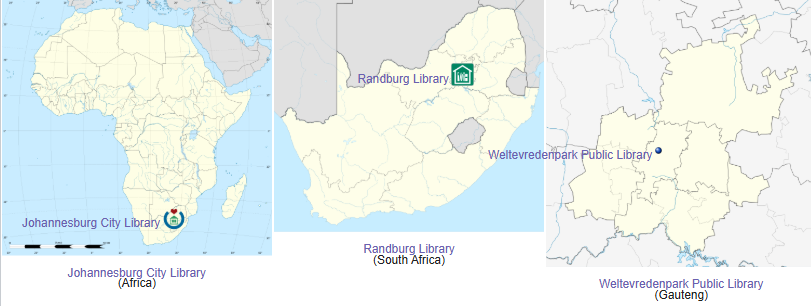
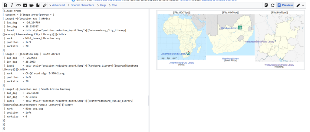
In these examples, I’ll take an earth centred perspective. My Library Dashboard contains three examples of maps that draw on English Wikipedia, Open Street Maps (OSM) and Wikimedia Commons. You will notice each map has a single library location where I have zoomed in (from continent to country to province). Here the latitude and longitude create a single node. Each map follows a slightly different labelling convention and points to a different data point on the contitnent.
On the left, the Johannesburg City Library (Africa) map relies on a commons image File:Africa_location_map.svg and an underlying layer appears when the module “Africa” is called.
Finding latitude and longitude of any place on the earth is also possible with online maps
Open Google maps and search for a location. eg. Johannesburg City Library
Drop a pin on the location and note the feedback in the popup
You’ll see two numbers that that looks like this
| lat_deg = -26.204789
| lon_deg = 28.038587
that’s the latitude (with a minus) and the longitude.
The same thing can be done on Openstreetmaps.
The latitude and long also appear in the url bar
Sometimes you can also right click on a location
2) Map Examples: Thematic maps
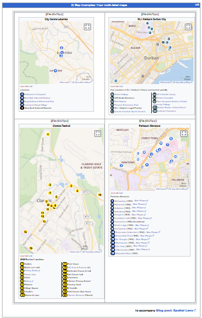
Below is a screenshot of four multi label thematic maps that I made. As opposed to the maps that only focus on location, these thematic maps are more about humans. You will see that these maps also have multiple locations.
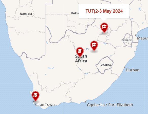
City Centre Lobamba – a map about places I would have liked to visit when I did a training session in Eswatini
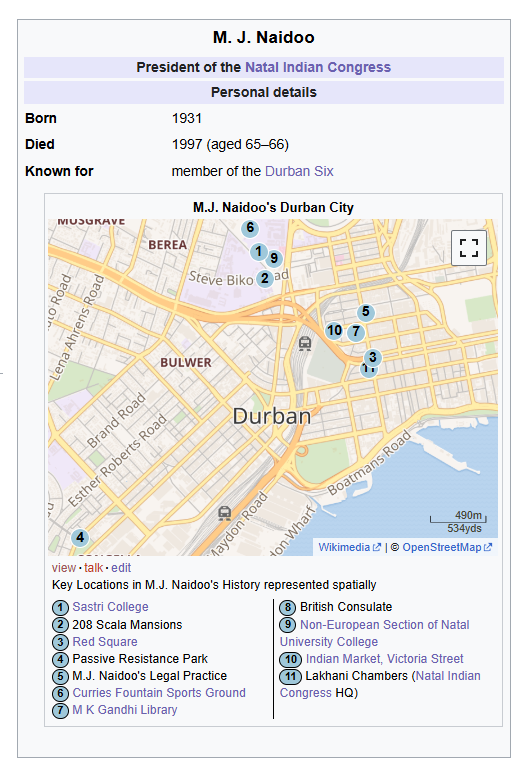
M. J Naidoo map is about the school, the park, the sports ground, and other places where this local leader was found. The map has a numbered label and has a key below. Both the label and the key links to another Wikipedia articles (also with maps).
Clarens Festival map: a map about popular culture locations for those who visit Clarens. Some are linked to Wikipedia or Wikimedia pages.
Parktown Mansions map is about the lavish homes that were built by Randlords and the blue plaques that accompany these buildings.
My inspiration: Stuart (my favourite counter-culture urban archaeologist) and Niall’s lovely work on the Grey Street Literary Trail inspired my efforts.
Mouseover on Map: You might notice that these maps are interactive. When your mouse or pointer hovers over label, an image, location or Wikipedia article appears. This allows the reader a quick preview before they click. Now your label and the location do not have to be the same. Let’s explore two labels.
Below is a small part of the code that created this map. Can you guess which of the four pins this code refers to?
{{Mapframe
|lat1 = -33.931
|lon1 = 18.424
|name1 = [[Cape_Peninsula_University_of_Technology|CPUT (26-27 Mar 2024)]]
|symbol1 = College
}}
Correct. The university of my friend and Professor – Johannes Cronje.
Can you see the TUT Campus, where I helped run a SWiP workshop. Go to the Wikipedia page and click on the Geo link on the top right and you will find some geo-cordinates
Now if you add these degree minutes seconds co-ordinates, to a map, they might not work and you will get an error message However these degree minutes seconds
|lat2 = 25° 43′ 55.92″ S, |lon2 = 28° 9′ 42.84″ E
can be converted into decimals to create your second location on the map.
|lat2 =- -25.7322 |lon2 =28.1619
You have started to build a multi label map. Do you think that you can add your own university? Or do you want to cheat and look at the code view.
Thematic Maps using Wikipedia Templates
Scope: In the two examples below, I will show how to plot UNISA’s campuses on a web map focused on South Africa. Or public libraries on a web map of Johannesburg.
These two templates have GREATLY simplified this process. They are called location map~ and location map+
{{Location map~ | South Africa
 | lat_deg    = -29.849383
 | lon_deg    = 31.00821
 | label      = [[University_of_South_Africa||UNISA]]
 | mark       = Blue pog.svg
 | position   = left
 | marksize   = 6
}}
Code Recipe:
{{Location map+ | South Africa
| caption = Locations of the public universities in South Africa
| alt = Locations of public universities in South Africa
| width   = {{{width|650}}}
| float = {{{float|right}}}
| places  =
{{Location map~ | South Africa
 | lat_deg    = -25.767
 | lon_deg    = 28.199
 | label      = <div style="position:relative;top:0.5em;">[[University_of_South_Africa|{{nowrap|UNISA}}]]</div>
 | mark       = Blue pog.svg
 | position   = left
 | marksize   = 6
}}
}}
Notice that both location map~ and location map+ “South Africa”. Now “South Africa” is a hidden layer with location data for South Africa in a module. Four co-ordinates will centre the South African Map
Guide for code: I want to display all the South African Universities that participated in SWiP. The project might expand, so I’ll need to add an unlimited number of marks and labels onto a map.
Step 1: Go to Your Wikipedia Sandbox Page
Step 2: Confirm the name of the area for the map – Its called South Africa
The UNISA co-ordinates will give me the location of UNISA on a South African Map as a background. Then I’ll add the first label onto the map, and where it should be in relation to the Now we can combine this individual map and it’s location into a number of points
Location + and Location ~
Look carefully in the code above. Can you see the word “Location”?
Location + | South Africa (this calls the module location map + and the category)
| caption = Locations of the public universities in South Africa (this appears at the bottom of the map).
| alt = Locations of public universities in South Africa (offers an alternate caption)
Crowdsourced geographic information on open street maps can be used to map geographic entities. I do this on phones on laptops, with open source software and Google tours. Maybe try a
An Uprising Tour (your history teacher might have an idea)
Ruined Stationbuilding Tour (post steam blight)
Authors, Screen Writers and their Scenes Tour (create pre-release media for a star)
Geography teaching in South Africa
Historians, archivists, geographers, librarians, ed techies (and not only geomaticians*) can now freely access software to make their own maps (geospatial knowledge graphs) . I’m no geomatician or cartographer. Just a rigger in the room working with these “refracted images that contribute to dialogue in our socially constructed world.” (Kelso quoting Harley). Notice how I expect you to take out your devices. How I give examples and code.
Lorraine Innes (2012) published a helpful piece on the history of Georgraphy teaching in South African Schools and mentioned the introduction of Geographic Information Systems (GIS) into the curriculum. We are one of the few countries that teach GIS. Sadly (according to Keid and van der Merwe) this is not done very well. There are many reasons…but the most obvious is “South African GIS instruction does not allow for Information Communication Technology (ICT) integration” See teaching GIS in SA schools, using problem based learning. The second is our in inadequate conceptions. Learning can be confusing. It also can be boring. But when you find the sweet spot between these two, it can be amazing. And you don’t have to have a full suite of computers.
Want to address the marginalization and exclusion that previous map makers manufactured? Looking to become a tour guide or firm up your game? Need to show that lecturer this work is yours (and not just made by ChatGPT). Go map and learn how to utilise Wikimedia’s map-making capabilities, to represent a series of under appreciated, remote, ignored or even blanked out territories is a way forward.
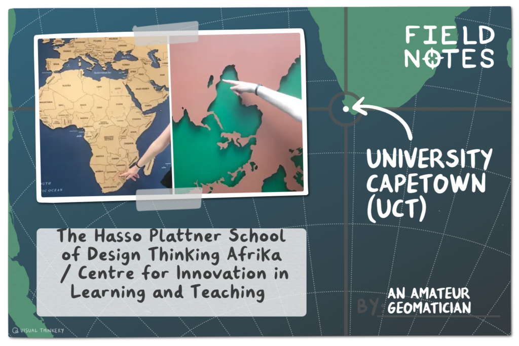
Cara is pointing at two maps. The conventional map is located the entrance of The Hasso Plattner School of Design Thinking Afrika. The upside down map, with a negative shape is located at CLTD. Both use the ”mercator projection.”