Maps are the loveliest way for us to see complicated geodata.
“Geomatics is the study of methods and technologies used to collect, distribute, analyse and present geographical, and spatial data, both natural and human-made”.
There are geomaticians with pen and paper (look out for Peter Slingsby ‘s routes and paths in the Drakensberg and Cederberg); tech giants with a street car, creating 360-degree views, Google’s local leveled guides awarding stars or Open Street Maps volunteers, contributing nodes, ways and relations for a Wikivoyage and their dynamic tourist maps. Cartographers. You make the earth beautiful. Me…I’m teaching myself about geodata. So these three posts comes with a Warning: This is a “brain dump”, its subject to regular revision and it might be long.
My outline for this post.
There are many ways to map a territory. Through commercially published services, by talking to people who know the terrain or by building your own map from the available data.
Reading my maps (and the territory)
Three examples of general purpose maps
Recipes for making general purpose maps
Four Examples of thematic maps (family, buildings, location)
Challenge: Making a tour guide map
Up next
Reading my maps (and the territory)
My maps (shared below) are not definitive. They are a starting point for dialogue. Much like a person may stop their car, and ask me for directions, and I may give them useful instructions or a pin with latitude and logitude pair
So Sho’t Left applies and when we are in mapping territory and you can cross a cartographic threshold. Why? Its important that you make sense of the landscape.
1) Map Examples: Three library maps
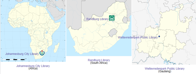
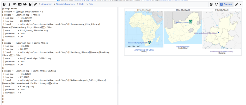
In these examples, I’ll take an earth centred perspective. My Library Dashboard contains three examples of maps that draw on English Wikipedia, Open Street Maps (OSM) and Wikimedia Commons. You will notice each map has a single library location where I have zoomed in (from continent to country to province). Here the latitude and longitude create a single node. Each map follows a slightly different labelling convention and points to a different data point on the contitnent.
On the left, the Johannesburg City Library (Africa) map relies on a commons image File:Africa_location_map.svg and an underlying layer appears when the module “Africa” is called.
Finding latitude and longitude of any place on the earth is also possible with online maps
Open Google maps and search for a location. eg. Johannesburg City Library
Drop a pin on the location and note the feedback in the popup
You’ll see two numbers that that looks like this
| lat_deg = -26.204789
| lon_deg = 28.038587
that’s the latitude (with a minus) and the longitude.
The same thing can be done on Openstreetmaps.
The latitude and long also appear in the url bar
Sometimes you can also right click on a location
2) Map Examples: Thematic maps
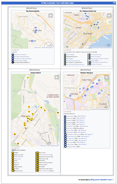
Below is a screenshot of four multi label thematic maps that I made. As opposed to the maps that only focus on location, these thematic maps are more about humans. You will see that these maps also have multiple locations.
City Centre Lobamba – a map about places I would have liked to visit when I did a training session in Eswatini
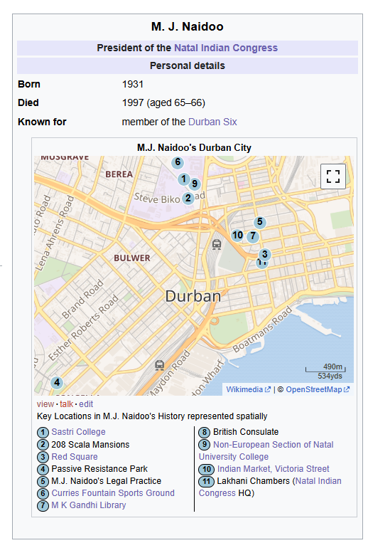
M. J Naidoo map is about the school, the park, the sports ground, and other places where this local leader was found. The map has a numbered label and has a key below. Both the label and the key links to another Wikipedia articles (also with maps).
Clarens Festival map: a map about popular culture locations for those who visit Clarens. Some are linked to Wikipedia or Wikimedia pages.
Parktown Mansions map is about the lavish homes that were built by Randlords and the blue plaques that accompany these buildings.
My inspiration: Stuart (my favourite counter-culture urban archaeologist) and Niall’s lovely work on the Grey Street Literary Trail inspired my efforts.
Mouseover on Map: You might notice that these maps are interactive. When your mouse or pointer hovers over label, an image, location or Wikipedia article appears. This allows the reader a quick preview before they click. Now your label and the location do not have to be the same. Let’s explore two labels.
Below is a small part of the code that created this map. Can you guess which of the four pins this code refers to?
{{Mapframe
|lat1 = -33.931
|lon1 = 18.424
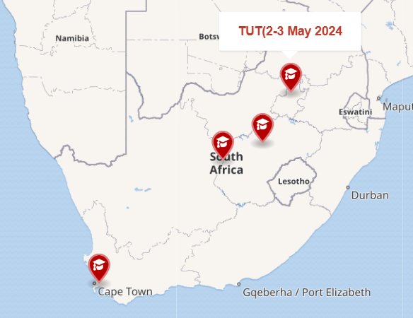
|name1 = [[Cape_Peninsula_University_of_Technology|CPUT (26-27 Mar 2024)]]
|symbol1 = College
}}
Correct. The university of my friend and Professor – Johannes Cronje.
Can you see the TUT Campus, where I helped run a SWiP workshop. Go to the Wikipedia page and click on the Geo link on the top right and you will find some geo-cordinates
Now if you add these degree minutes seconds co-ordinates, to a map, they might not work and you will get an error message However these degree minutes seconds
|lat2 = 25° 43′ 55.92″ S, |lon2 = 28° 9′ 42.84″ E
can be converted into decimals to create your second location on the map.
|lat2 =- -25.7322 |lon2 =28.1619
You have started to build a multi label map. Do you think that you can add your own university? Or do you want to cheat and look at the code view.
Thematic Maps using Wikipedia Templates
Scope: In the two examples below, I will show how to plot UNISA’s campuses on a web map focused on South Africa. Or public libraries on a web map of Johannesburg.
These two templates have GREATLY simplified this process. They are called location map~ and location map+
{{Location map~ | South Africa
 | lat_deg    = -29.849383
 | lon_deg    = 31.00821
 | label      = [[University_of_South_Africa||UNISA]]
 | mark       = Blue pog.svg
 | position   = left
 | marksize   = 6
}}
Code Recipe:
{{Location map+ | South Africa
| caption = Locations of the public universities in South Africa
| alt = Locations of public universities in South Africa
| width   = {{{width|650}}}
| float = {{{float|right}}}
| places  =
{{Location map~ | South Africa
 | lat_deg    = -25.767
 | lon_deg    = 28.199
 | label      = <div style="position:relative;top:0.5em;">[[University_of_South_Africa|{{nowrap|UNISA}}]]</div>
 | mark       = Blue pog.svg
 | position   = left
 | marksize   = 6
}}
}}
Notice that both location map~ and location map+ “South Africa”. Now “South Africa” is a hidden layer with location data for South Africa in a module. Four co-ordinates will centre the South African Map
Guide for code: I want to display all the South African Universities that participated in SWiP. The project might expand, so I’ll need to add an unlimited number of marks and labels onto a map.
Step 1: Go to Your Wikipedia Sandbox Page
Step 2: Confirm the name of the area for the map – Its called South Africa
The UNISA co-ordinates will give me the location of UNISA on a South African Map as a background. Then I’ll add the first label onto the map, and where it should be in relation to the Now we can combine this individual map and it’s location into a number of points
Location + and Location ~
Look carefully in the code above. Can you see the word “Location”?
Location + | South Africa (this calls the module location map + and the category)
| caption = Locations of the public universities in South Africa (this appears at the bottom of the map).
| alt = Locations of public universities in South Africa (offers an alternate caption)
Crowdsourced geographic information on open street maps can be used to map geographic entities. I do this on phones on laptops, with open source software and Google tours. Maybe try a
An Uprising Tour (your history teacher might have an idea)
Ruined Stationbuilding Tour (post steam blight)
Authors, Screen Writers and their Scenes Tour (create pre-release media for a star)
Geography teaching in South Africa
Historians, archivists, geographers, librarians, ed techies (and not only geomaticians*) can now freely access software to make their own maps (geospatial knowledge graphs) . I’m no geomatician or cartographer. Just a rigger in the room working with these “refracted images that contribute to dialogue in our socially constructed world.” (Kelso quoting Harley). Notice how I expect you to take out your devices. How I give examples and code.
Lorraine Innes (2012) published a helpful piece on the history of Georgraphy teaching in South African Schools and mentioned the introduction of Geographic Information Systems (GIS) into the curriculum. We are one of the few countries that teach GIS. Sadly (according to Keid and van der Merwe) this is not done very well. There are many reasons…but the most obvious is “South African GIS instruction does not allow for Information Communication Technology (ICT) integration” See teaching GIS in SA schools, using problem based learning. The second is our in inadequate conceptions. Learning can be confusing. It also can be boring. But when you find the sweet spot between these two, it can be amazing. And you don’t have to have a full suite of computers.
Want to address the marginalization and exclusion that previous map makers manufactured? Looking to become a tour guide or firm up your game? Need to show that lecturer this work is yours (and not just made by ChatGPT). Go map and learn how to utilise Wikimedia’s map-making capabilities, to represent a series of under appreciated, remote, ignored or even blanked out territories is a way forward.
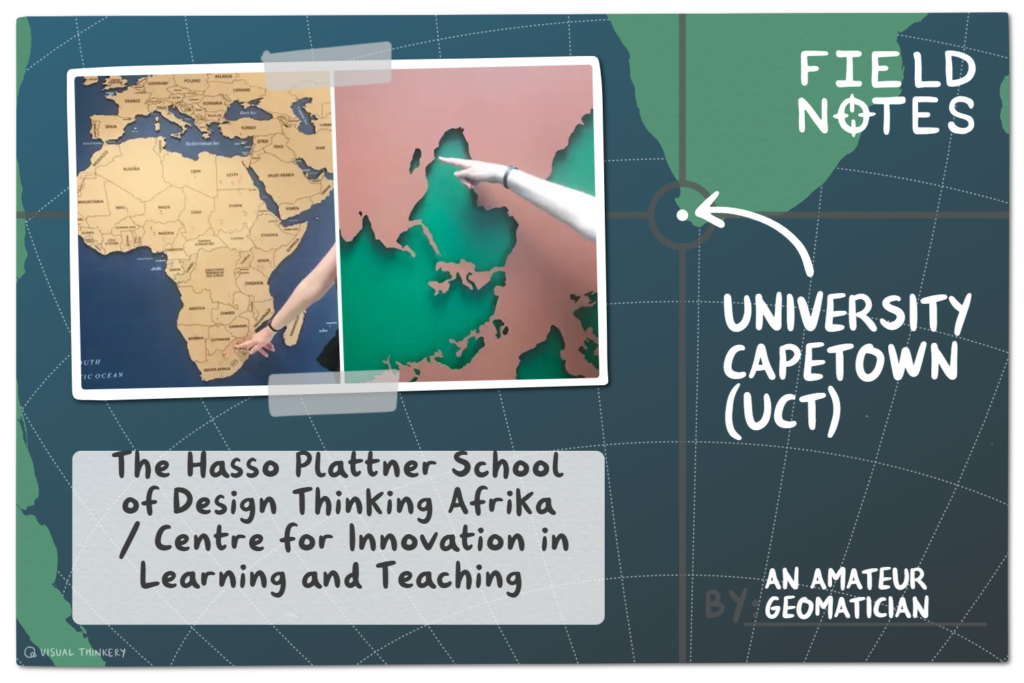
Cara is pointing at two maps. The conventional map is located the entrance of The Hasso Plattner School of Design Thinking Afrika. The upside down map, with a negative shape is located at CLTD. Both use the ”mercator projection.”
Leave a comment
Commentators are sacred. Facts are free.Cancel reply